MAD MONEY CONSULTING
Branding + Logo Design
The Client
Mad Money Consulting is a trusted CPA, supporting small and micro-businesses through accounting and consulting services. Inspired by an inside joke with the owner Brooke Bellamy’s grandmother, “mad money” represents safety and working together towards a sense of financial security and comfort—whatever that may look like for each individual person, client, or business.
Why They Came to Us
Mad Money’s owner, Brooke Bellamy, is bold, youthful and forward-thinking. Her original logo didn’t feel authentic to her brand and its direction any longer. It was too obvious and clunky. The logo was not made with the intention of using it in multiple applications. She was in search of something more abstract that would be recognizable and feel true to her and her brand, while standing out from her competitors.
Mad Money Consulting is a trusted CPA, supporting small and micro-businesses through accounting and consulting services. Inspired by an inside joke with the owner Brooke Bellamy’s grandmother, “mad money” represents safety and working together towards a sense of financial security and comfort—whatever that may look like for each individual person, client, or business.
Our Approach
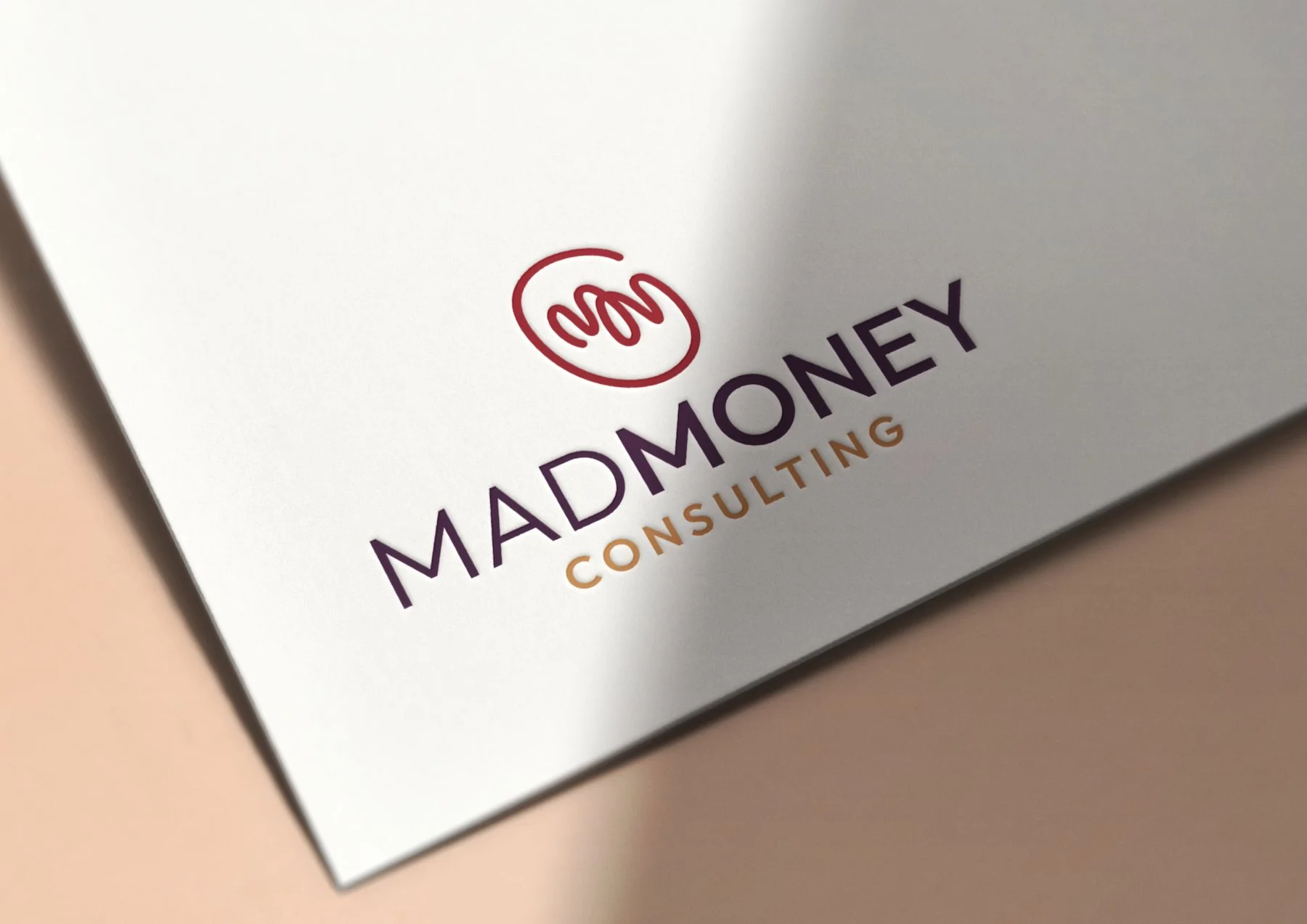
Correnti Marketing embarked on an exciting journey to develop a fresh, fun logo and visual identity for Mad Money. First things first, we knew we weren’t going to follow the direction of many of their financial competitors, meaning we weren’t going to use obvious dollar signs or charts with upward arrows. Understanding the significance of visual representation, we crafted a striking, abstract logo that embodies the essence of financial expertise and professionalism but also stays true to Brooke’s fun nature.
Our team meticulously designed a cohesive visual identity that aligns with Mad Money's values, evoking a sense of trust and credibility. The result was a compelling, distinctive, and different logo and visual identity that positions Mad Money as a standout brand in the competitive landscape of financial services.
LOGO DESIGN + VISUAL IDENTITY
Process
Mad Money’s old logo did not stand out amongst the many money symbols and graphs that plague the financial industry. Our team enthusiastically embraced the challenge of developing three new logo options for Brooke based on the information gathered during our discovery call.
Taking into account her unique brand attributes and preferences, we presented "wild card" options that pushed the boundaries of creativity. These distinct and daring logo designs showcased our commitment to providing innovative solutions and allowed our client to see each option in practice, enabling her to make an informed decision on the logo that best aligned with her vision and resonated with her target audience.
Results
We typically allow for two rounds of major revisions with minor revisions until the visual identity journey is complete. Mad Money only had one major revision… meaning, we nailed it! In just two weeks, we went from the presentation of logo options to the logo in our client’s hands. And that’s on speedy feedback!
Brooke ended up falling in love with an abstract MMC, the acronym for her company name—as did we! The logo mark lends itself well to a beautiful pattern that can be applied in many different formats, like the background of a social post, PowerPoint template, or letterhead.


